CUE POWER
CUE POWER
CUE POWER
CUE POWER
POOL & SNOOKER ENTERTAINMENT
POOL & SNOOKER ENTERTAINMENT
POOL & SNOOKER ENTERTAINMENT
POOL & SNOOKER ENTERTAINMENT
Brand Identity & Visual System
Brand Identity & Visual System
Brand Identity & Visual System
Brand Identity & Visual System
Project Overview
Cue Power needed an identity system that reflected the energy of the venue without falling into the visual clichés common within pool and snooker branding.
The existing brand lacked consistency and felt disconnected across applications. The goal was to create a cleaner, more recognisable identity that felt modern, confident, and built for long-term use across signage, merchandise, and digital platforms.
Brand Strategy & Creative Direction
The direction focused on simplifying the brand without stripping away personality.
Rather than leaning into overly detailed graphics or retro styling, the identity was rebuilt around bold typography, a clean visual structure, and a distinctive logomark designed to hold attention quickly.
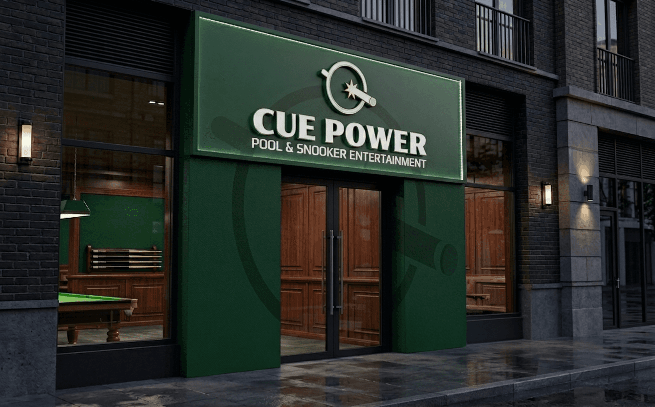
At the centre of the brand is a simplified logomark based on an existing graphic, featuring a cue ball with a cue smashing through it. The mark was intentionally designed to be easy to read at a distance — particularly important for signage, apparel, and social media use. Supporting this is a bold wordmark that reinforces the venue’s confident, entertainment-focused positioning.
Brand Strategy & Creative Direction
The direction focused on simplifying the brand without stripping away personality.
Rather than leaning into overly detailed graphics or retro styling, the identity was rebuilt around bold typography, a clean visual structure, and a distinctive logomark designed to hold attention quickly.
At the centre of the brand is a simplified logomark based on an existing graphic, featuring a cue ball with a cue smashing through it. The mark was intentionally designed to be easy to read at a distance — particularly important for signage, apparel, and social media use. Supporting this is a bold wordmark that reinforces the venue’s confident, entertainment-focused positioning.


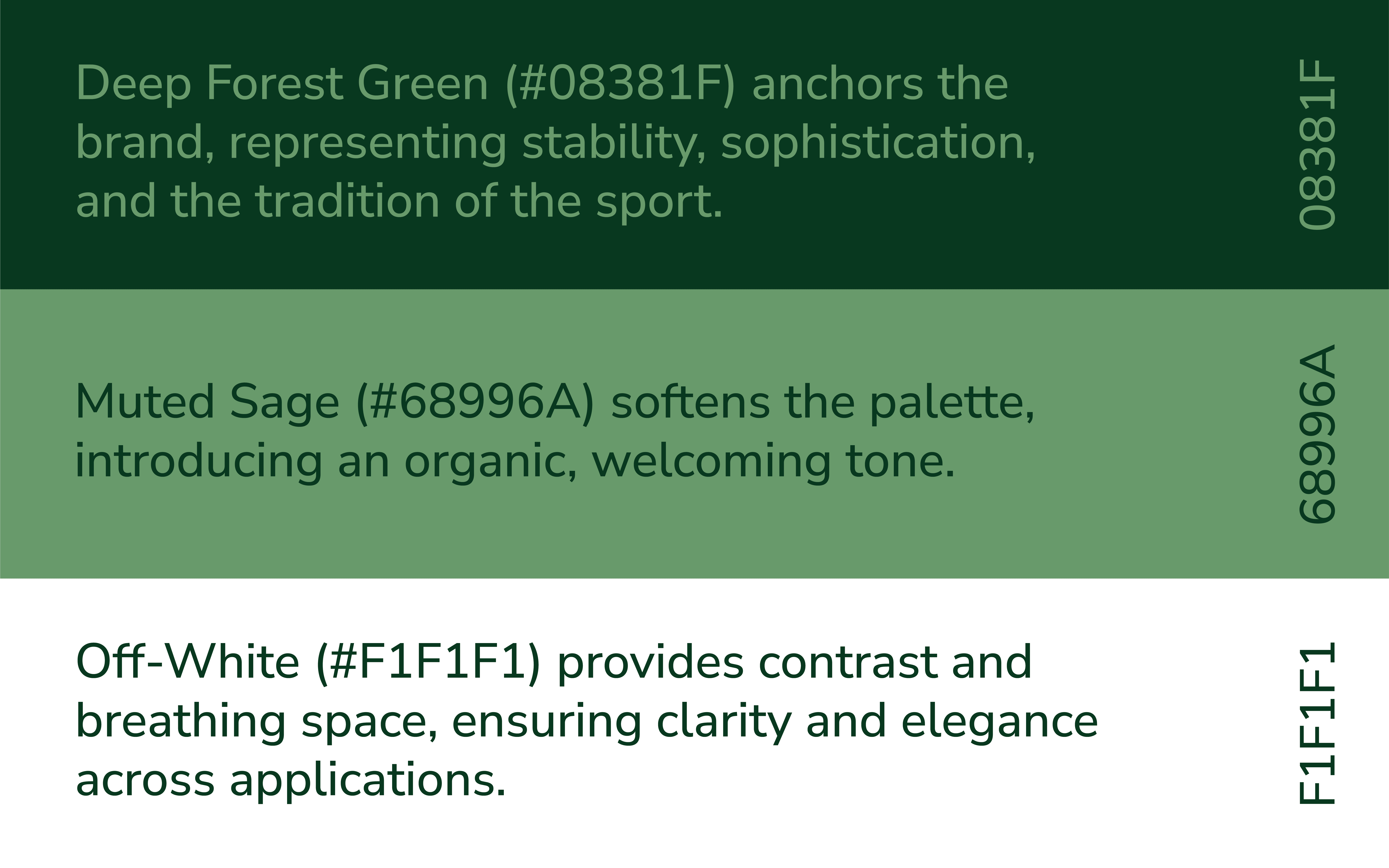
Colour System
The colour palette takes direct influence from traditional billiards environments while refining it into something more controlled and contemporary.
Deep green anchors the identity and ties directly to the game itself
Bright accent green introduces energy and contrast, while also deliberately being a chalk like colour
Off-white keeps the system clean and highly legible across applications
The contrast creates a stronger visual presence without relying on excessive effects or detail.
Logo System
The identity was built as a flexible logo system rather than a single locked-up mark.
This allows the brand to adapt across:
Exterior signage
Social media assets
Apparel and merchandise
Promotional graphics
Digital advertising
Each variation maintains recognition while giving the brand more practical usability across formats.
Monogram & Mark
The “WG” monogram acts as a flexible brand asset designed for recognisability at smaller scales. Its fluid, custom form reinforces the personality of the primary logo while standing strong as a standalone mark.
This allows for versatile use across:
Apparel and merchandise
Course signage
Social media and digital icons
Logo System
The identity was built as a flexible logo system rather than a single locked-up mark.
This allows the brand to adapt across:
Exterior signage
Social media assets
Apparel and merchandise
Promotional graphics
Digital advertising
Each variation maintains recognition while giving the brand more practical usability across formats.


