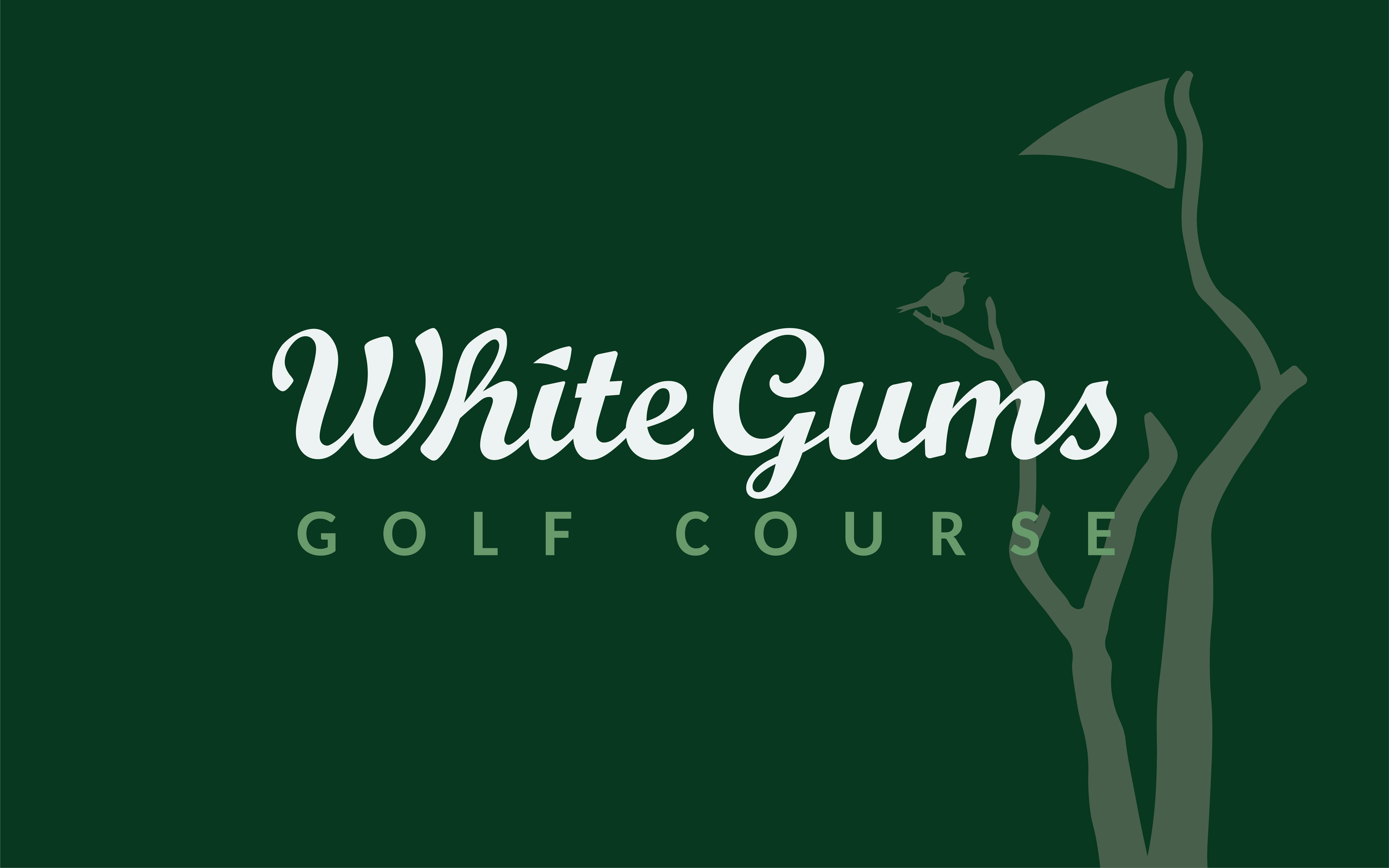
WHITE GUMS
WHITE GUMS
WHITE GUMS
WHITE GUMS
GOLF COURSE
GOLF COURSE
GOLF COURSE
GOLF COURSE
Brand Identity & Visual System
Brand Identity & Visual System
Brand Identity & Visual System
Brand Identity & Visual System
Project Overview
White Gums Golf Course required a brand identity that reflected the calm, and natural experience of the course whilst positioning it as a premium destination for golfers.
The goal was to create a visual system that felt refined yet approachable—capturing both the prestige of White Gums and the serene atmosphere of the surrounding landscape.
Brand Strategy & Creative Direction
The creative direction focused on balancing heritage and modern simplicity.
Key considerations included:
Creating a sense of heritage and prestige without feeling exclusive.
Reflecting the natural environment of the course.
Ensuring flexibility across print, merchandise, and digital applications.

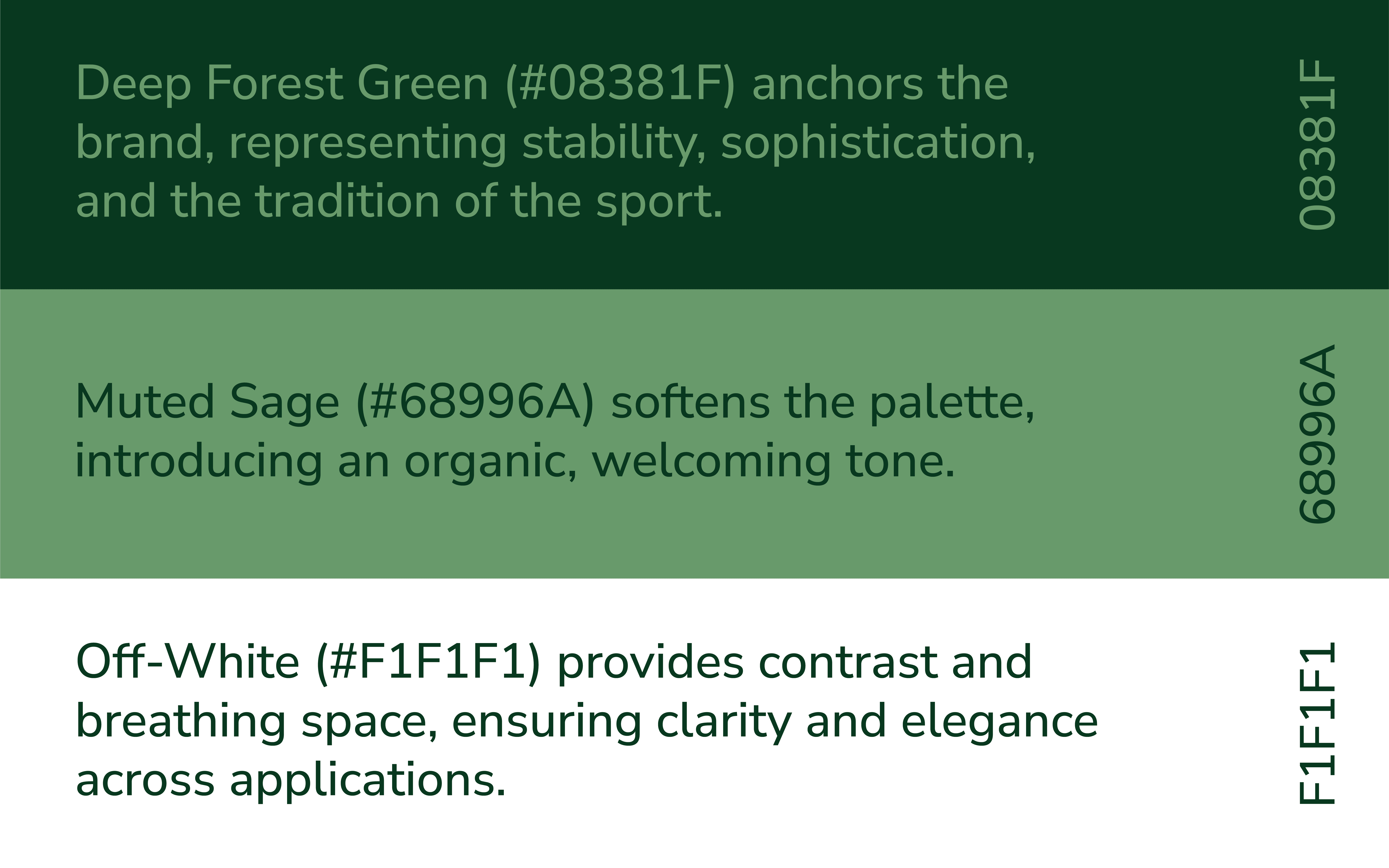
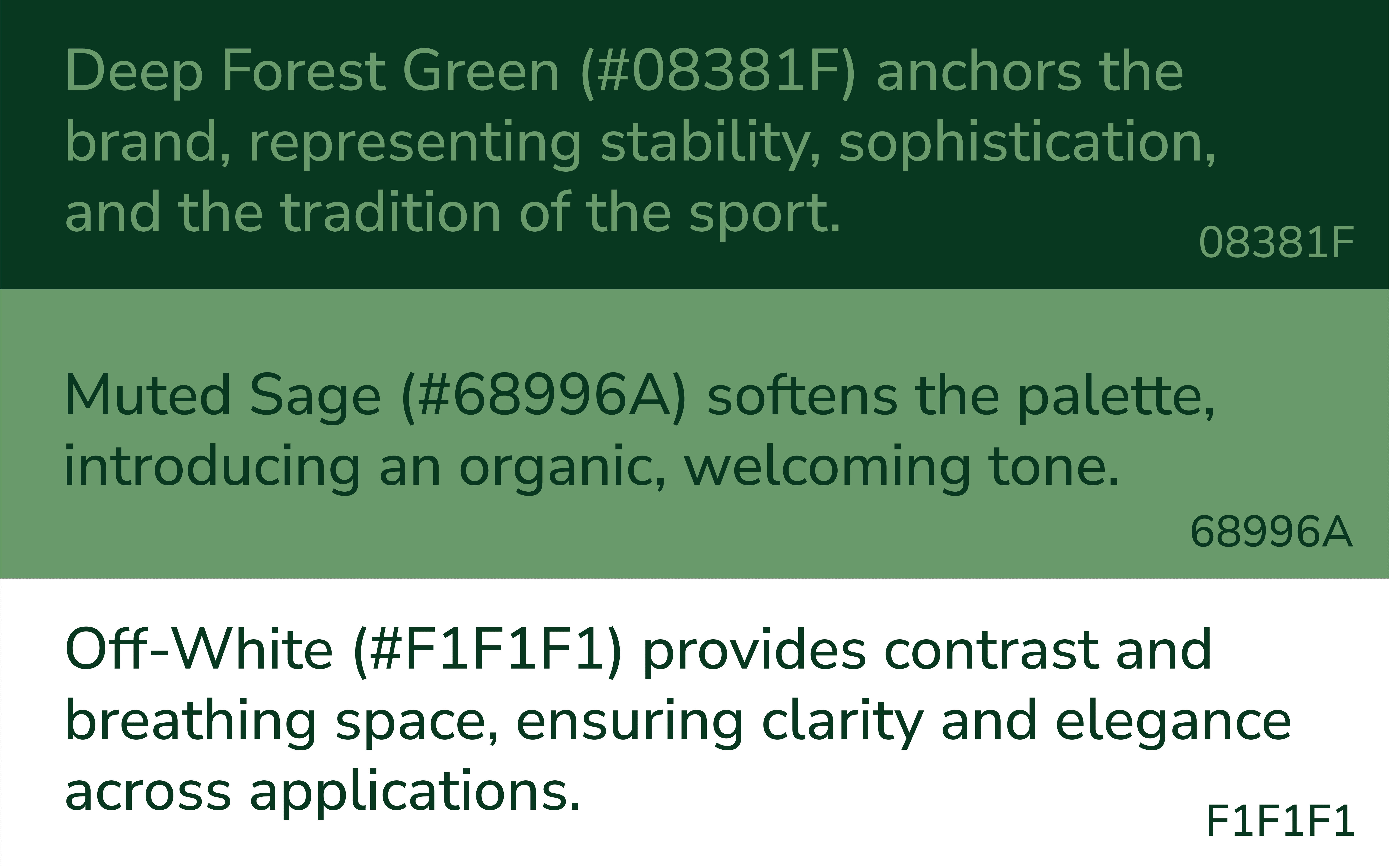
Colour System
The colour palette draws heavily from the natural surroundings of the course, using layered greens to evoke freshness, depth, and tranquillity.
A combination allowing the brand to feel both premium and grounded, avoiding the overly corporate or dated feel common in the category.
Colour System
The colour palette draws heavily from the natural surroundings of the course, using layered greens to evoke freshness, depth, and tranquillity.
A combination allowing the brand to feel both premium and grounded, avoiding the overly corporate or dated feel common in the category.
Colour System
The colour palette draws heavily from the natural surroundings of the course, using layered greens to evoke freshness, depth, and tranquillity.
A combination allowing the brand to feel both premium and grounded, avoiding the overly corporate or dated feel common in the category.
Colour System
The colour palette draws heavily from the natural surroundings of the course, using layered greens to evoke freshness, depth, and tranquillity.
A combination allowing the brand to feel both premium and grounded, avoiding the overly corporate or dated feel common in the category.
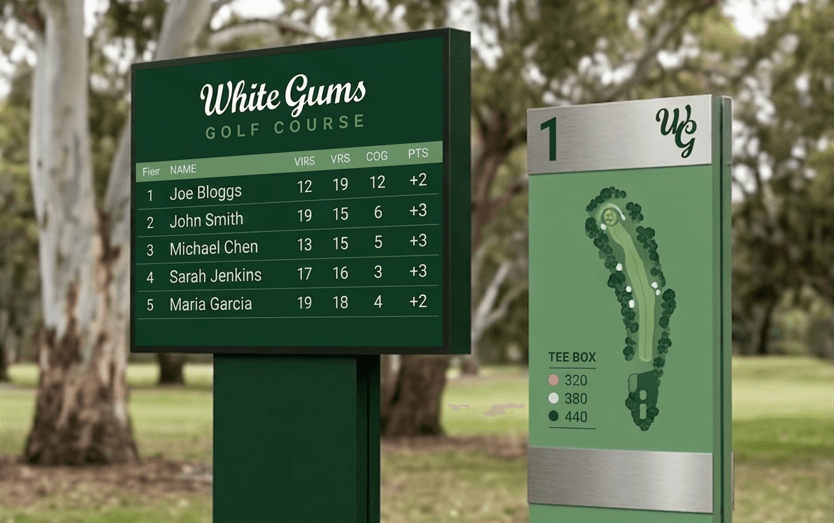
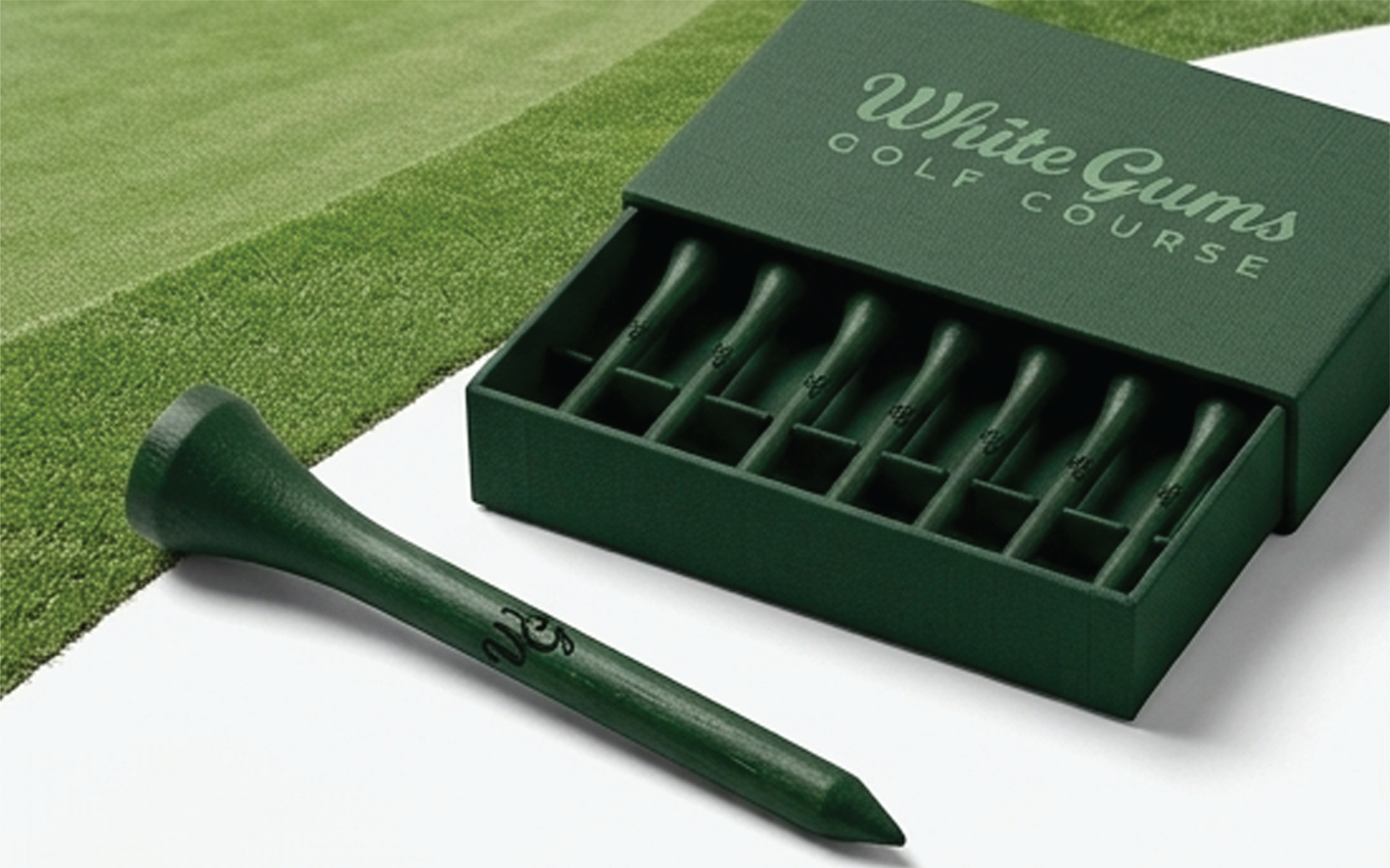
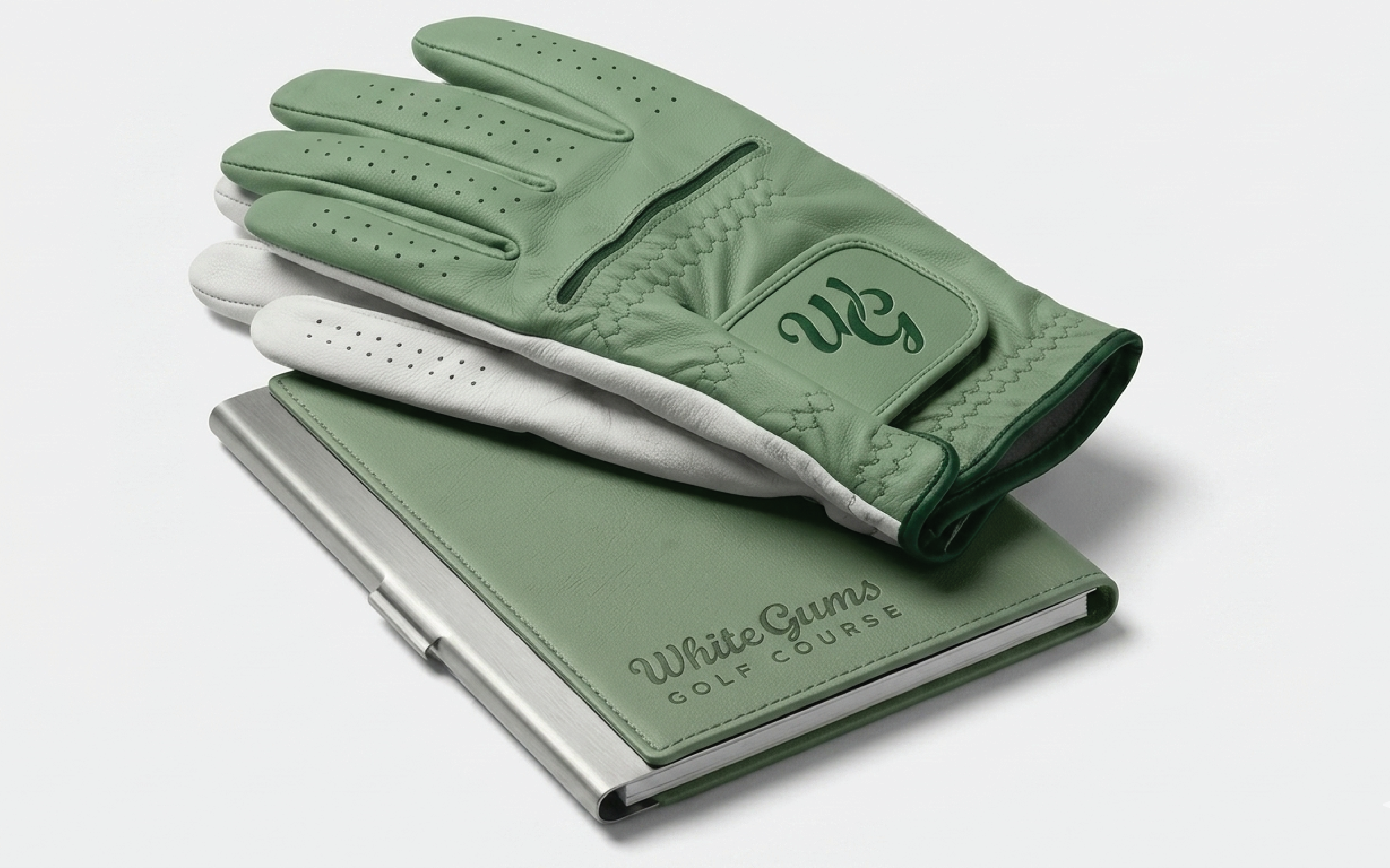
Monogram & Mark
The “WG” monogram acts as a flexible brand asset designed for recognisability at smaller scales. Its fluid, custom form reinforces the personality of the primary logo while standing strong as a standalone mark.
This allows for versatile use across:
Apparel and merchandise
Course signage
Social media and digital icons
Outcome
With the identity we have created White Gums is positioned as a course that feels premium, but not exclusive.
A brand that fits its environment — and functions properly wherever it shows up because it’s built as a system, not a single logo.
It’s recognisable without being loud
It’s flexible across real-world use cases
It feels considered, not decorative
It is designed to be timeless.


